Everyone loves colors. Humans have a genuine affinity towards colors. Colors evoke feelings, convey messages, and add a sense of element to things around us. Just like in kindergarten, where everybody wishes to have the largest box of colored pencils or the assorted range of crayons. The fascination seldom fades with time.
And owing to their basic nature, colors also play an integral part in how logos affect your emotions. When you visit busy highstreet areas, you see business logos all around trying to get your attention. Notice them closely and you’ll see many are subtle & quiet, while many are loud and attention seeking. Different color tones used in logos make them catchy or subtle to your eyes.
Exactly what do colors state, how have famous brands utilized them to their advantage & what are the key takeaways for new businesses wanting to follow in the footsteps of these famous companies. Let’s explore.
Table of Contents
Logo Design, Color Psychology & Human Emotions

Yellow : The Color of Optimism, Clarity & Warmth
A wise man once said, “If you like yellow, you’re a good fellow.”
Clearly so, yellow symbolises the sun & inspires to look on the bright side. Feelings of optimism, clarity & warmth are conveyed effortlessly by the yellow color. Being a rich color, it also makes the audience mind think of gold, wealth or treasure. And the most amazing quality of the yellow color is that it stands out, even in a crowded spot. You just can’t miss yellow.
Yellow is a powerful positive color, hence brands use it when they want to put a smile on the customer faces. But, yellow is used in many other ways as well.
Take for example, the famous golden arches of McDonalds’. They are kid friendly. But when you see the golden shield coupled with brown used by UPS in its logo, you get a subtle dignified feeling. golden arches are kid-friendly and fun while UPS’ gold and brown shield is more subtle and dignified.
Ferrari the italian giant, uses the power of yellow to stand out. At the same time, CAT being in the machinery and construction industry uses yellow in a manner that is totally different. Since yellow signifies warning for machines & other related industries, warning or danger lights used are generally yellow in color.

Orange : The Color of Friendliness, Confidence & Enthusiasm
Orange is a color that doesn’t hold back. It stands out in a bunch and sends out a message, “Look at me, I’m the center of attraction.” Orange is creative, young, and enthusiastic.
Harley Davidson uses orange in its logo along with black and white to tame it a little & reduce some of its “in the face” quality. The final result is as tough and appealing as it can get.
Orange is naturally a kids color because of its vibrant cheerful energy. Nickelodeon splatter is orange and thus catches eye of young people everywhere across the globe. Similarly Fanta and formerly Crush also used orange color for their soda to lure in people with a sweet tooth.
Gulf Petro uses orange to make a statement that its a professional company that hones and supports the young generation. Similarly Firefox Browser uses an orange fox in its logo to showcase the speed of a fox, energy and the friendliness of their organization to attract the young generation to use their famous internet browser.

Red : The Color of Excitement, Youth & Boldness
When people look at it, red, the color of excitement can actually raise their heartbeats. It’s a bold colour that’s gets your blood pumping. Red is the color of love, romance & blood. That’s why it creates a sense of warmth and urgency. From roses to stop signals, red is used to convey that powerful feeling.
Red specially works great in the entertainment market. Nintendo’s logo is minimalistic with a simple font and virtually no design component, still the usage of red makes it look amazing. Similarly Netflix also uses the power of red; with bold alphabet logo. Even online logo maker tools such as BrandCrowd utilise the power of red to get their message across.
Superstores such as Target use red; to create that sense of urgency. It pushes individuals to buy, and works really well when a sale is going or is in its last hours.
Coca-Cola also takes benefit of the welcoming nature of red. The logo, coupled with the strong advertising of the company brand, makes the drink into something that calls strong positivity and affection to the mind.
Toyota & Vodafone both use the power of red to form a bond or connection with their customers, while coming across as bold and youthful.
Purple : The Color of Creativity, Imagination & Wisdom
Purple is a royal color. It portrays an image of immaculate grandeur and mysticism. It activates the imagination & creativity of a person and refreshes the eyes. Purple carries an, “anything is possible” vibe. And companies leave no chance to use this. Using this color, companies try to draw in customers which are looking for a more than ordinary experience.
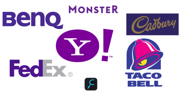
As a company that helps in finding jobs, Monster uses the color purple to portray power in its job search tool and rate of success.
Taco Bell, the global mexican fast food specialist, uses purple color to induce a feeling amongst customers that their fast food places are a luxury thing and sets them apart from the rest.
FedEx, another global logistics organization employs purple for its brand. The purple color in their logo adds a value of luxury as well as a feeling of responsibility that their packages will be delivered across the world in time.
BenQ is another company that manufactures monitor screens, projectors, and other screen technology products. Their tagline is “Bringing Enjoyment N’ Quality of Life” which shows as initials in their logo; the purple color adds luxury and an element of quality to the brand.
Cadbury’s also uses purple color with gold to make their offering appear luxurious. Their chocolates are indeed the most savored in the world.
Yahoo, the internet giant uses purple to stand out, and appear as a more than ordinary personalized experience for its users.

Blue : The Color of Trust, Dependability & Strength
Blue is the color of strength & dependability. Sit by the ocean on a clear day, or look up in the sky on a clear day. You will the ever so calming blue. But its not just calm, it symbolizes enormous strength too, just like the ocean and sky. Blue makes you feel dependable and gives a sense of tranquillity.
Technology brands like HP, Dell, and Intel make the most of blue color’s message; they create reliable products which individuals can depend on day after day. Brands that sell appliances and machines also use blue to create a feeling of trust about their products amongst the customers; Ford and GE both utilize it.
Internet social media giants Twitter & Linkedin also use blue effectively to create a feeling of a grand dependable online platform that users can trust for social media.
Blue is a very effective color to depict strength and trust, both at the same time. Firms use it to pride of their professionalism. We almost forgot to mention, Comparingly’s very own logo also hones the same quality of trust and dependability.

Green : The Color of Peace, Growth & Health
Now that we’ve discussed the color blue of our planet, let’s talk about mother nature for a bit. Green is what comes to mind. Its a peaceful color that exhibits serenity and conveys that growth is consistent.,/p>
Company brands use the same ploy to make the consumes believe in their brands and the brands’ growth. Many brands whose products are based around environment use this color to create an awareness and sense of peace. Green is pleasant to the eyes as well, which makes it very good for the food industry as well. Because food has to look appealing and enticing. Hence the companies start the drill with their logo.
Animal Planet being connected to earth and nature uses green color. John Deere, the agricultural vehicles & tools manufacturing company also uses green color to symbolize its connection with the environment.
BP, the petroleum company uses green to symbolize growth and health. They portray their way of giving back to the planet through the green color. Whole foods is a food based company. Green color for them signifies health that the customers are concerned about round the clock.
We all know the growth and story of Starbucks, one of the biggest coffee chains in the world. They also use green color in their logo to add a feeling of refreshment, health and growth to their brand.
Black & White : The Color of Balance, Calmness & Simplicity
Now let’s talk about one of the greatest combination of colors, Black & White. Almost every logo discussed above usually produces a black and white version of its logo for universal use. Black and White complement each other. Black is the absence of color, whereas white is a combination or mixture of all the colors.
There are plenty of theories about black and white, specially that of Yin & Yang, which symbolizes the positive and negative in life, or the greater balance of life. When black and white are combined with each other or other colors, the results are usually remarkable.
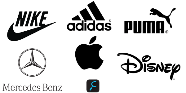
Black signifies authority and credibility. White on the other hand is clean and pure. This helps strike a balance and tweaking both these colors rightly results in a strong combination of elegance and simplicity. Sports brands like Puma, Adidas and Nike use the color black to add an edge to their brand vibe.
When black is combined with shiny silver or gray, that adds a lot of timeless character naturally. Most of the luxury car companies use this tactic to attract customers. Mercedes-Benz for example, uses this combination of colors to create a feeling of being timeless.
Disney and Apple both use the same color combination as well to make their brand feel eternal or timeless to customers.

Multiple Colors : The Feeling of Diversity & Grandeur
We hope you’ve seen a rainbow in your lifetime. What are the feelings you can recollect from the time you saw it. The feeling would be fulfilling, oneness with yourself and nature, peace, calm, joy, excitement, thrill, everything at the same time. That’s what combination of multiple colors can do for your brand as well, provided your approach is spot on.
Brands which have achieved a level of phenomenal growth or aspire to grow that much, use multicolor approach in their brand logos. Take for example, Billboard by Sony provides entertainment in multiple ways meaning content that suits all colors of life. Toy’R’Us also gives all forms of joys to kids in the form of their toys, hence the beautiful colored approach in their logo.
Similarly, ebay offers almost everything in the world on their platform, hence the usage of multiple colors.
Do Microsoft & Google even need an introduction? They both are a huge part of our lives today. Major chances are, you’re currently working on a computer that is running on a Windows OS. And your favorite everyday search engine is none other than the Big ‘G’ a.k.a Google.
Thus, it can be correlated that multiple colors add the feeling of diversity & grandeur to a brand. Then again, we mentally accept a multicolor look of a brand only when we know it has grown that big and affected our lives in a bigger way. So, not everyone can play with those colors.
Final Thoughts
The role of color psychology in logo design is a very deep topic which fascinates average daily people and scientists alike. Emotions are a part of humans and colors influence these our emotions, thus affecting our everyday choices as well. It doesn’t take rocket science to understand the effect of colors on our life, and if we pay close attention to the colors around us, we can easily identify how colors are effecting our daily lives.
When designing a logo or getting a logo designed, remember the theories associated with these colors and you can come out with the best combination of colors that represents your brand truly and effortlessly.
This is the reason most of the logo contest sites present color templates to a customer during the time they’re filling up their logo design brief, in order to understand what kind of emotions the client wants their logo to evoke.
Be right with your brand colors, that’s a great recipe for a great brand! Have comments or suggestions, fill us in.


3 Comments
Beautiful post about colors and emotions. I loved how you structured the post. Surely inspiring.
This is a topic that’s close to my heart… Many thanks!
I am extremely inspired with your writing talent as well as the format on your blog. Keep up the excellent quality writing, it is uncommon to see a nice weblog like this one today.