Logo Design Trends keep evolving every year & the logo designers have to keep a lot of things in the head while designing a logo because it needs to leave that lasting impression on the onlooker. Rebranding a business logo is not what happens everyday, thus freelance logo designers have to make sure that a brand logo depicts the company ethos completely and effortlessly.
Come to think of it, Isn’t it a lot that we expect from a logo. The tiny little thing has to portray the vision behind a brand seamlessly to the customers while not looking cluttered at all. Well we strolled across the web and industries to bring you the 14 most comprehensive & evergreen eye catching logo design trends of all time. If you’re looking for a logo design for your brand, sticking to these basics will make sure you stay ahead in the game. Over to you.14 Logo Design Trends used by Freelance Logo Designers
Minimalist Logo
One of the most sought after logos are minimalist in nature. They are simple, easily understandable and very to the point. These days a lot of big brands are following this ideology and rebranding their logos to look clean and uncluttered. Look at the new logo of AIRBNB. They adopted a rebranded minimal logo removing excessive clutter.

This one by OPTIMODO seems to depict a company whose theme is related to walking, thus the two legs in the place of the alphabet ‘A’.

Broken Letter Logo
Logo designers are using broken letter forms to take alphabet usage in designing to the next level. The results are indeed truly amazing because these broken letters could be used to depict objects and add vibrancy overall. OPENLY came out with this amazing brand logo using a Broken ‘O’. Notice how the Open ‘O’ adds to the open theme of the brand as well.

SMASH used smashed broken alphabets to depict their brand name. The logo depicts the name and the dynamic values of the brand both at the same time.

Flat Design Logo
These days, everybody seems to be switching to flat design. Its the favorite of all major companies & freelance logo designers as well. Flat out text, no textures, gradients or shadows. GOOGLE, the internet giant did the same and came out with an amazing flat design logo.

Talking of the design industry space, we saw the biggest and the most trusted graphic design crowdsourcing marketplace 99DESIGNS launch a huge logo design contest on their own platform to rebrand their company logo. Finally they adopted a flat design as well. Need we say more. The one producing designs for the world itself chose a Flat Logo Design.
Gradient Logo
Gradient colors add great volumes to a logo design. Designers use this technique along with flat colors to add amazing vibrancy to a design. INSTAGRAM had a rebranding last year that received wildly varying responses. Many criticized it whereas many appreciated the same at the same time. Personally we think, this new logo looks amazingly brilliant.

Look at the clean lines and the colorful implementation of gradients in this great logo design by VIVIDWAYS.
Handmade Logo
Its not easy to convert a handmade design to digital form. But the originality and the appeal factor of a handmade logo inspires the designers to take up this challenge. Hand drawn designs are pleasing to the eyes because of the human connection. Look at these awesome hand drawn masterpieces.


Text Logo
Designers like to play around with fonts and typography all the time. Playing around with text and its styling will stay trending for good. Look at these awesome text logos. TOYS ‘R’ US uses a neat and colorful text design logo.
FLYER logo plays with fonts as well as shadows too. Notice the cool effect the projecting shadows are adding to the overall appearance of a very simple looking logo.

Framed Text Logo
Framed Text inside a frame is a great method to bring the focus of a customer immediately to the design or the message behind it. Look at these great examples of how putting the text inside a frame brought the attention directly to the message the brand wants to give.


Line Art Logo
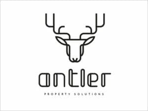
This is a very tough logo design technique, but totally worth the effort. It uses a single line stroke to draw the image and merge text along with it, still the design looks very balanced. GRANTS WOODPECKER uses this amazing line art logo design.

ANTLER also uses a similar line art logo design that just stands out brilliantly.
Stacked Letter Logo
When the text is long, logo designers use this smart technique to put everything together. Rearranging the alphabets by stacking them above one another adds a great look and feel to a logo design. Oakland Museum of California uses this cool stacked letter logo. The museum consists of a lot of artwork. Well we can see that starting from the logo itself.

Now, look at this amazing piece of work. There is a slant from the top down, depicting a slanting door in between the alphabets.

Geometric Shape Logo
Clean and simple geometric shapes rule the roost since forever. Logo Designers use common geometric shapes such as triangles, circles, etc. to bring out amazing logo designs. The automotive giant BMW uses geometric circle quadrants in its traditional logo. It has been rebranded many times but the shape and feel remained the same always.

Take a look at the logo ZENDESK used to have until recently. The designer used half cut circles and triangles to depict the alphabet ‘Z’ and it does not strike to the eyes at first that its actually not the alphabet ‘Z’ but geometric shapes put together. Cool work no ?

Vintage Logo
Anything that takes a customer back to memories can help in establishing an instant connect which will be beneficial for the brand. Vintage logos do the same. This timeless style has been around since long and looks like it will stay the same way as well. Look at these evergreen vintage logo designs that have the power to take you back to the good old times.


Overlapping Gradient Logo
Logo Designers use gradient overlaps to bring out amazing color combinations. Gradients add that vibrancy and overlaps add that eye pleasing feel to a logo design. Even big companies like MASTERCARD have adopted this technique in their brand design.


Black & White Logo
Any trend may go out of style, but a black and white logo design will always stay in fashion. The same is seen appreciated widely by companies worldwide. ADIDAS and NIKE, two biggest giants of the sports industry following in the footsteps.
Negative Space Logo
One of the most interesting trends lately. Its not very easy and takes a really talented logo designer to carve out visual interpretations from the negative space in a logo. In this following design, the logo designer has used the negative space brilliantly to depict a carrot in the hands of a rabbit.

Doesn’t take rocket science to make out that this following logo by RAMOTION is about a company offering house moving services. See how smartly the negative space between the hand is used to depict a house.

Closing Words
Well, looks like 2017 will be full of amazing logo redesigns & updates, backed by these prevailing logo design trends covered above. Here’s to an amazing year ahead full of colors and designs.
Head over to our reviews & comparison section now to compare the Best Logo Design Contest Sites. Choose a Logo Design Crowdsourcing Marketplace that suits your budget & requirement. Get an amazing business logo for your brand today.




10 Comments
This site was…how do I say it? Such a Time-saver!! Finally I found something that helped me. Thanks a lot!
It’s a remarkable post designed for all the web people, they will obtain benefit from it I am sure.
So glad I stumbled upon this article. I was looking for some ideas for my logo design. This article gave me multiple inspirations. Thanks a ton to the author. Keep up the great work.
Good post. Thanks for the information my friend. Greetings from KL !
My brother recommended me this article. He was totally right. This actually made my day. Everything I needed in one place. Thanks.
I was looking for some design trends and glad that I came across this. This web page has the most updated information posted about almost all logo design trends. Great find.
Nice collection of different logo styles.
These are quite interesting tips about logo design. It is very true that outstanding creative designs attracts attention and creates a positive impression about a brand so its better it is done by experts in the field. I got valuable tips to implement in our business logos from this post.
My favorite logo design style from the list is the use of negative space. Its pretty evergreen and adds a strong character to a logo imho. By the way, great job with the comparingly logo. Your designer has made a very good use of the negative space to depict the alphabet ‘N’ in your brand name.
Great post. Definitely worth a read.